
Hockey Goal Visualizations
by Jizhou Wang, Abhay Puri, Binulal Narayanan, Qilin Wang
Presented by this notebook
Data acquisition
To analyse the NHL play-by-play data, we have acquired its games from season 2016-2017 to 2020-2021.
Our data acquisition came from the play-by-play API described here.
Each game’s info can be accessed by it’s 8-digit GAME_ID using RESTapi from the endpoint “https://statsapi.web.nhl.com/api/v1/game/GAME_ID/feed/live/”. Example: Game ID 2016020001.
Code Tutorial
With the code shown here, the data can be acquired by specifying the year and the location stored. Eg. dfs = loadstats(2019,'./data')
It will be stored in the a pandas dataframe explained by the docstrings.
Interactive Debugging Tool
Using ipywidgets we have created an interactive tool shown below.
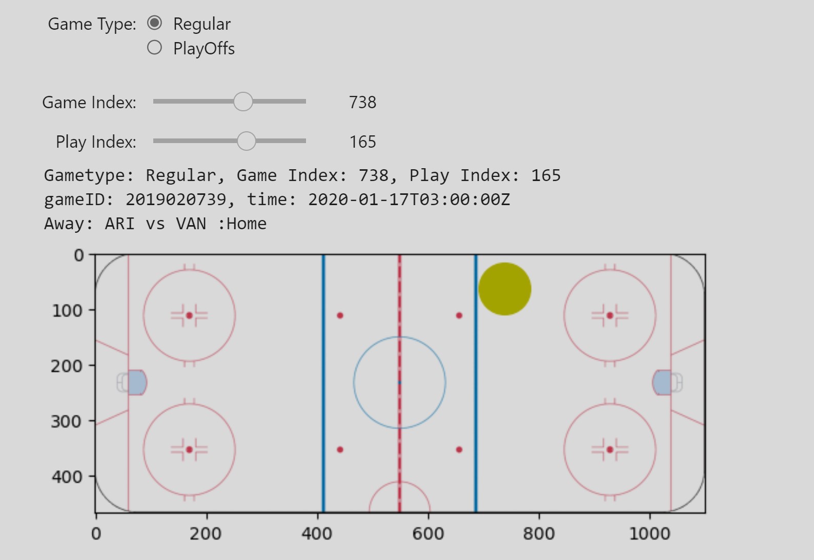
The widget displays the visualization of a play event on the rink, and also displays the relevant play information. We can choose any play event in any game given a season dataframe taken from the data acquisition function. An option to choose if a game is in a regular season or playoffs is also included.
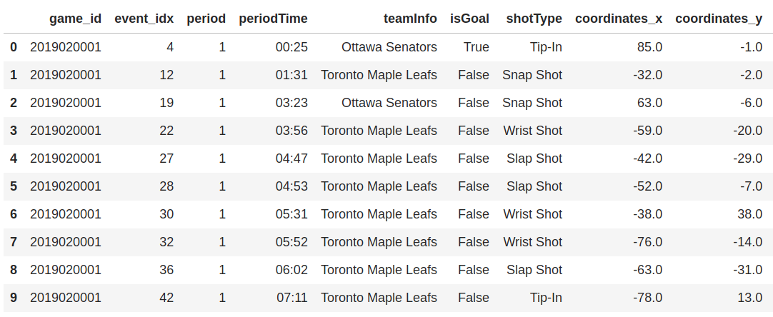
Tidy Data
We have formatted the acquired data in a way that makes it easier for us to analyse the shots/goals across the season. The function can be found here
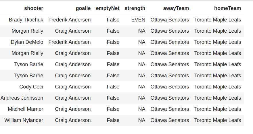
A snippet of the dataframe
Simple Visualizations
A bar chart of shot types over all teams
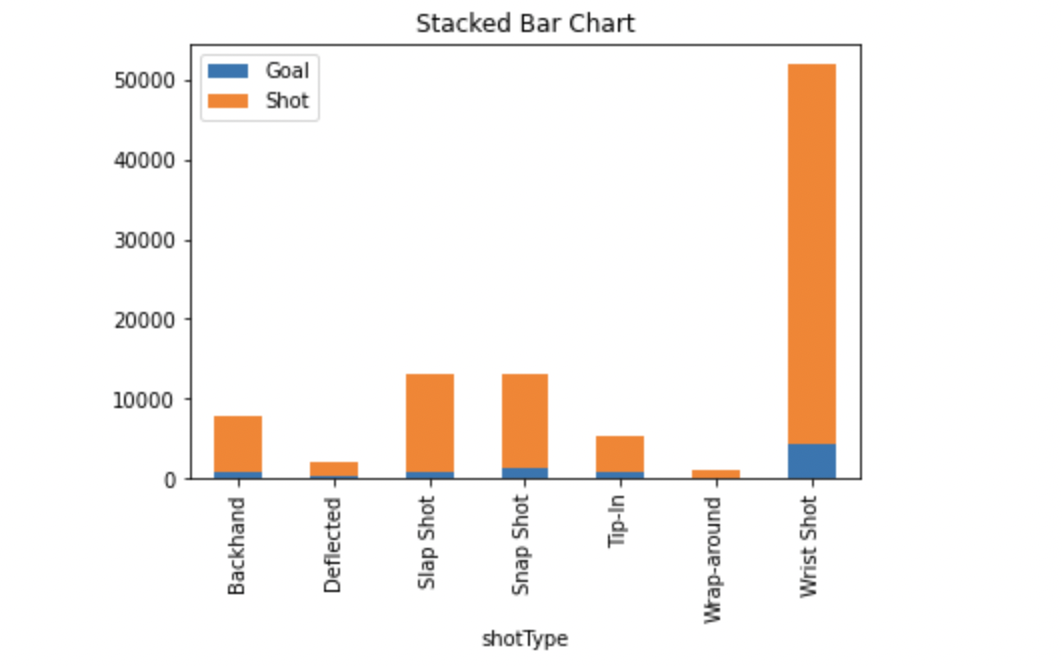
We can tell visually that the most dangerous type of shot is tip in because it has the highest percentage of goal. The snap shot is also notably dangerous since the percentage is close to tip in.The most common type of shot is wrist shot because this shot type has attempted more than any shot type in the dataset.
Shottype vs Distance Heatmap
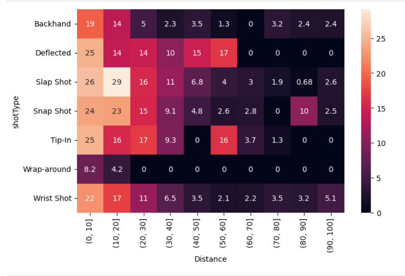
The heatmap shows the goal percentage as a function of both distance and shot types. On the horizontal axis, a distance category of [0, 10] means the shot distance (Euclidean distance between shot and net) is between 0-10 feet. The value in each box indicates the chance of scoring with this particular shot type and distance.
The most dangerous type of shots is slap shot taken within 10-20 feet of the net - it has a 29% chance of scoring. The least dangerous types of shot when taken closed to the net (less than 20 feet) is the wrap-around.
Another interesting thing is that while most of the shot types have around 20% of scoring chances, the chances drop by a large amount when the distance is between 10-20 feet. We can see this by comparing the first and second column. The implication is that for teams who take primarily in the 10-20 feet area, they might have an incentive to try to place primarily slap shots and snap shots rather than the other kind of shots.
Advanced Visualizations
Below is a rotated (counter-clockwise) hockey rink map. The x-axis represents the width of the arena, and y-axis is a half length of the arena. In each region, white means the number of shots placed in this area is comparable to the league average. Red indicates a higher than average number of shots, while blue indicates less. The intensity of color indicates how strong the deviation from average is.
A few examples from Colorado Avalanche
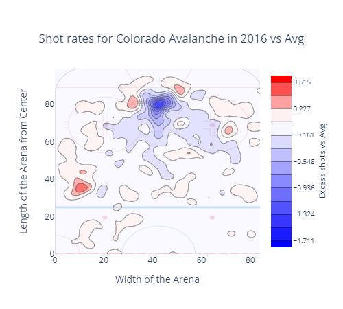
In 2016, the shot frequency from Colorado is less or equal to league average (suggested by the blue and white color area) on almost every area of the arena, except on the left side area where it is 60 feet away from the net. In particular, they take far less shots in the area that is 0-30 feet away from the net, suggesting they has a hard time placing shots in the most threatening area.
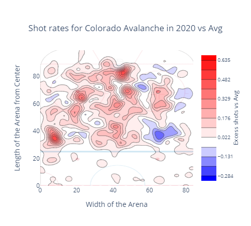
In 2020, the shot frequency from Colorado is higher than league average on most of the areas (suggested by the red color area), especially on the left side. In particular, they take far more shots in the area that is 0-30 feet away from the net, suggesting they has a much easier time placing shots in the most threatening area.
This suggests they are now a leading team in the league. The team ranking confirms our impression: Colorado was ranked last in their division in 2016, with 22 win out of 82 games; they ranked first in 2020-2021 season, winning 39 out of 56 games.
A few examples from Tampa Bay Lighting and Buffalo Sabres
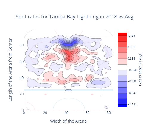
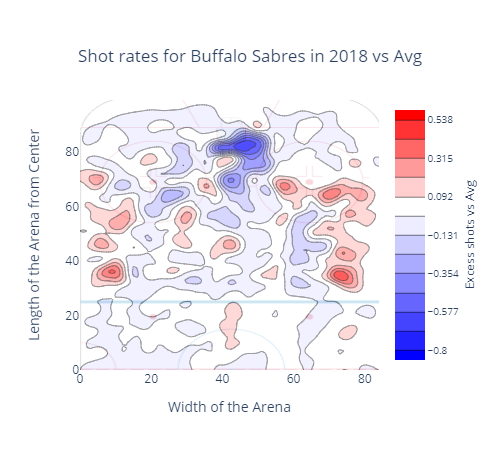
Tampa Bay has far more shots than league average in the center area, especially at the area 0-30 feet away from the net, where threat of shots is highest. Sabres on the other hand has less shots than league average, except at some peripheral areas. This suggests that Lightning’s is more successful at organizing attacks, and only place shots where it has a relatively high scoring chance (i.e. close to the net). In contrast, Sabres seems not able to shoot in close range where the threat would be the highest. Their above average shooting in the peripheral area suggests that they are forced to released shots in unfavorable places.
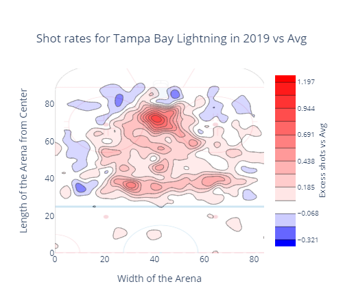
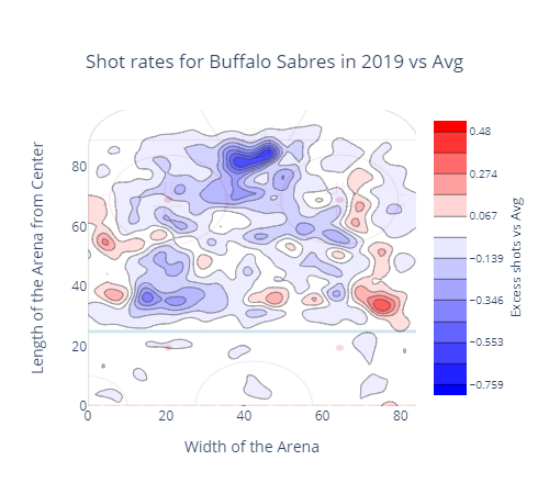
Lightning’s has made significant improvement over season 2018: their average shots is higher than league average almost everywhere. They also have far more shots in the 80-90 feet area compared to 2018, which was their weakest area. The Sabres’ maintains the same kind of performance, struggling to get shots in the 0-40 feet away from net area that is right in front of the net, meaning their shots are most likely to be lower quality shots.
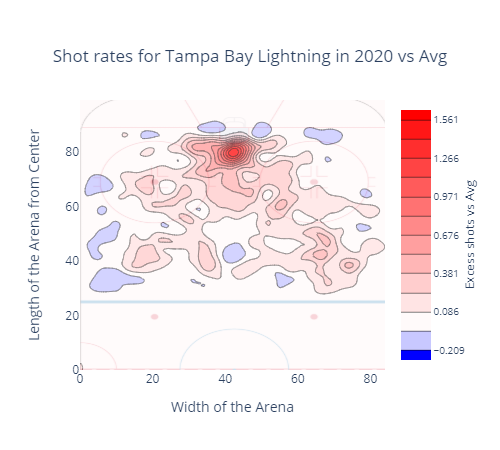
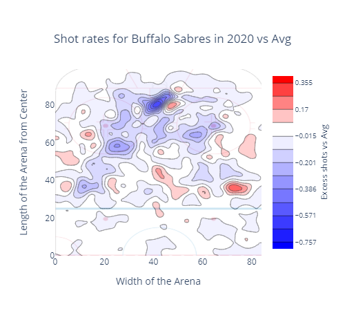
If we look at the the y-axis, the excess shots vs Avg is significantly higher for Lightning’s compared to previous season. They continue to dominate most of the area, meaning that not only do they have more shots, most of the shots were placed right in front of the net as well. The Sabres’ shots however, has a similar to pattern to the previous years. They have not improved.
In conclusion, Lightning’s has a shot pattern that excels in quality (the area of the shot) and in quantity (the overwhelming red area), and they have improved every season (the y-axis has to be adjusted). Sabres has lower quantity of shots (the blue area) and in particular, the shot quality is very low (the dark blue area in front of the net).
tags: Hockey - Goal - Visualizations