
Hockey Goal Predictions
by Jizhou Wang, Abhay Puri, Binulal Narayanan, Qilin Wang
Presented by this notebook
In the previous post we showed how to obtain, tidy and visualize NHL games data. Now, let us experiment with the data to predict goals.
Experiment Tracking
The experiments described in this blog are logged to this comet.ml workspace.
Feature Engineering Part 1 & Visualizations
For feature engineering, we have visualized the data to get an intuition of outliers, biases that could be present for feature selection/imputation later on.
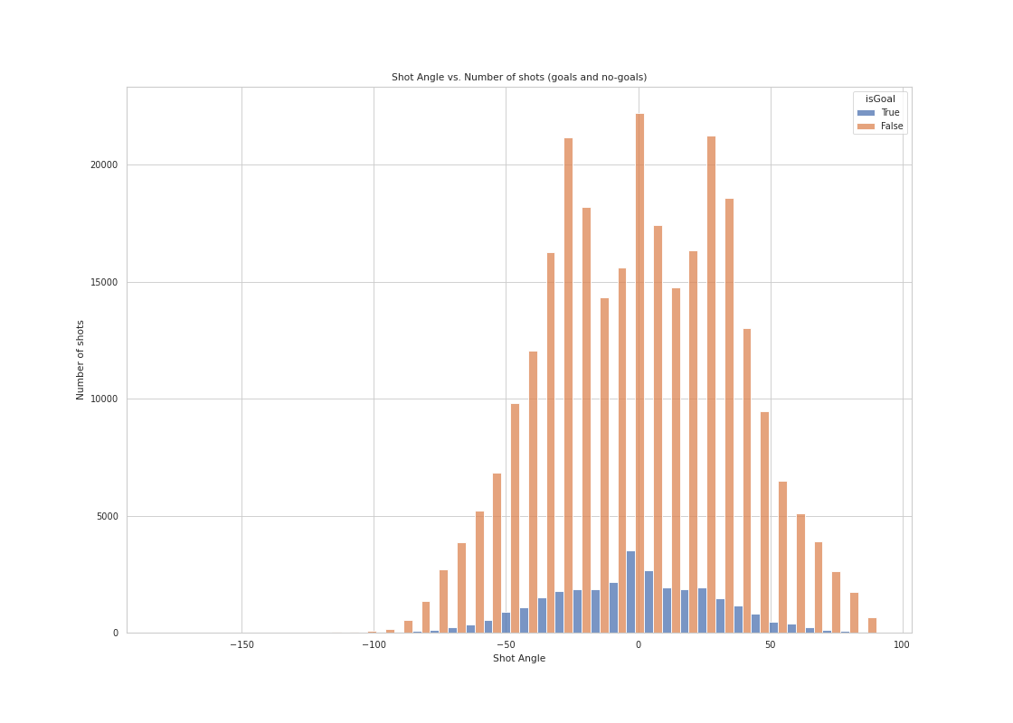
A histogram of shot counts (goals and no-goals separated), binned by angle
Although teams like to shoot around -30, 0 (meaning shooting directly in front of the net) and 30 degrees, the goals are distributed as bell-curve shape with 0 degree shots having the highest probability to score.
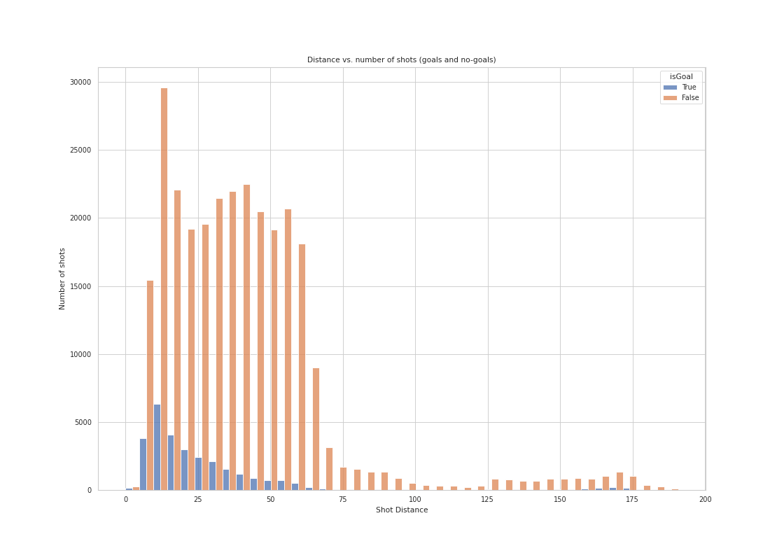
A histogram of shot counts (goals and no-goals separated), binned by distance
Scoring is harder when the shot distance is larger than 25 feet, yet teams shots are quite evenly distributed across different distances. Shots are rare past 70 feet, which makes sense as it is shot from the defensive zone.
A 2D histogram where one axis is the distance and the other is the angle. You do not need to separate goals and no-goals
It seems that shots have a very hard time turning into goals when shot angles are larger than 50 or when distance larger than 40.

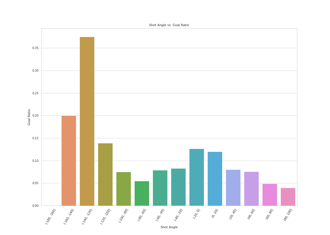
A histogram of shot distance/shot angle vs goal ratio
The goal ratio is highest within 20 feet, lower when between 20-40 feet and much lower outside of 40 feet. It seems that as shot distance increase past 100 feet, the goal ratio starts to increase again. It suggest that, although the number of shots taken at a higher distance is low, the opportunity of scoring when taking a long shot is high. This makes sense especially when there is an empty net.

The goal ratio to shot angle seems to have a bell-shape curve around zero from 90 to -90 degrees. Although interestingly the goal ratio increases dramatically from -90 to -180 degrees. After looking at the data and verifying with some video examples (Sharp Angle Shot footage), it suggest that, although the number of shots taken at this angle is low, the opportunity of scoring when taken can be high.
A histogram of goal, binned by distance (separated empty net and non-empty net events)
![]()
An examples of wrong information (rinkSide):
Given gameID: 2018020953 and eventidx: 368 with Jakub Voracek’s goal, we have found that data was wrongly recorded with a much larger shot distance while scoring on a non-empty net shown here.
Baseline Models
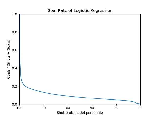
For our baseline, we used a logistic regression model with only a single distance to goal metric. After fitting to the shot data, it has achieved an accuracy of 0.91 and an AUC score of 0.69. However, the model pushes all its predictions towards non-goal situations, which means that it will predict all outcome to be a non-goal. Therefore, it has a zero score on precision, recall and f1-score for shots that are goals. This is a sign of overfitting because we want our model to predict situations that would result in a goal as well.
All simple features tested on the logistic regression model:
- Distance only
- Angles only
- Distance & Angles
- Random only
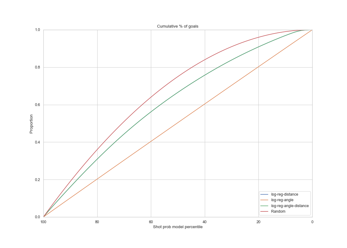
Summary of all four models plotted
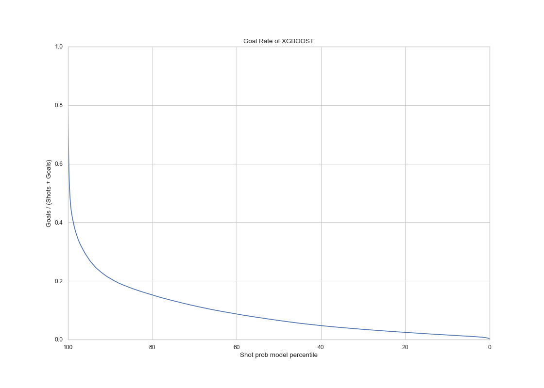
Goal Rate

The goal rate curves of different models. The logistic regression with angle only plot seems to be predicting a constant goal rate at every shot percentile, which does not seem to be reliable when determining goals.
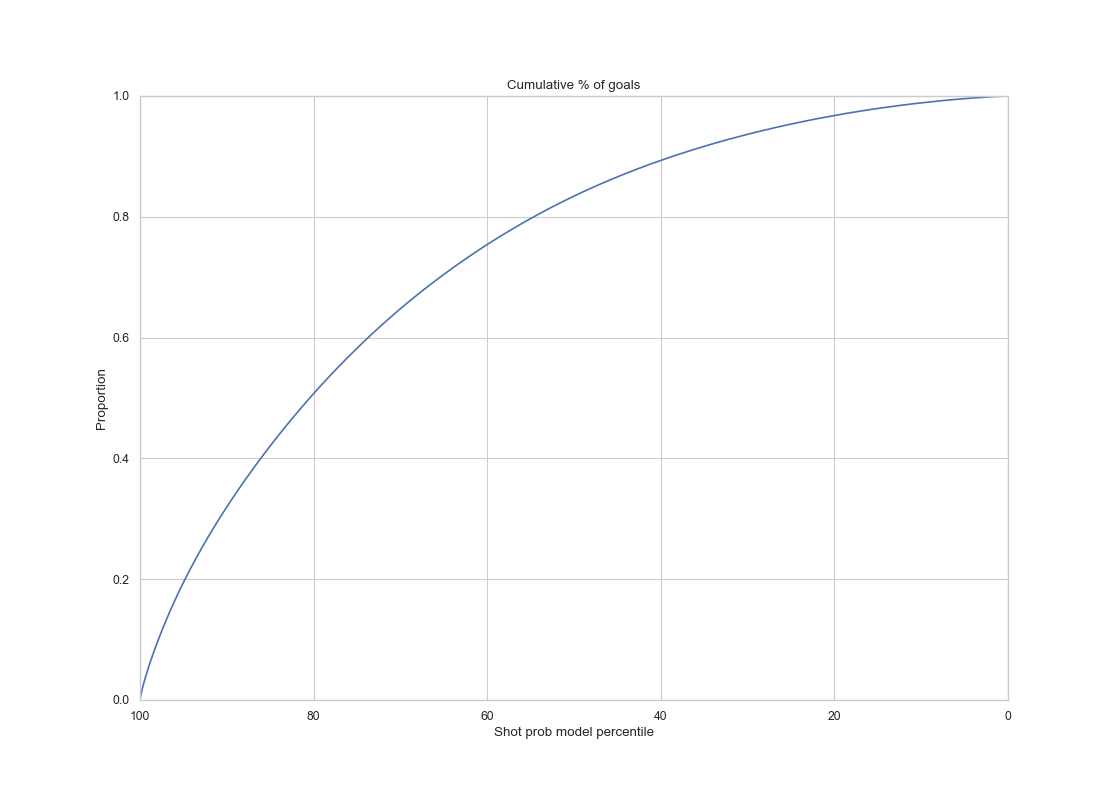
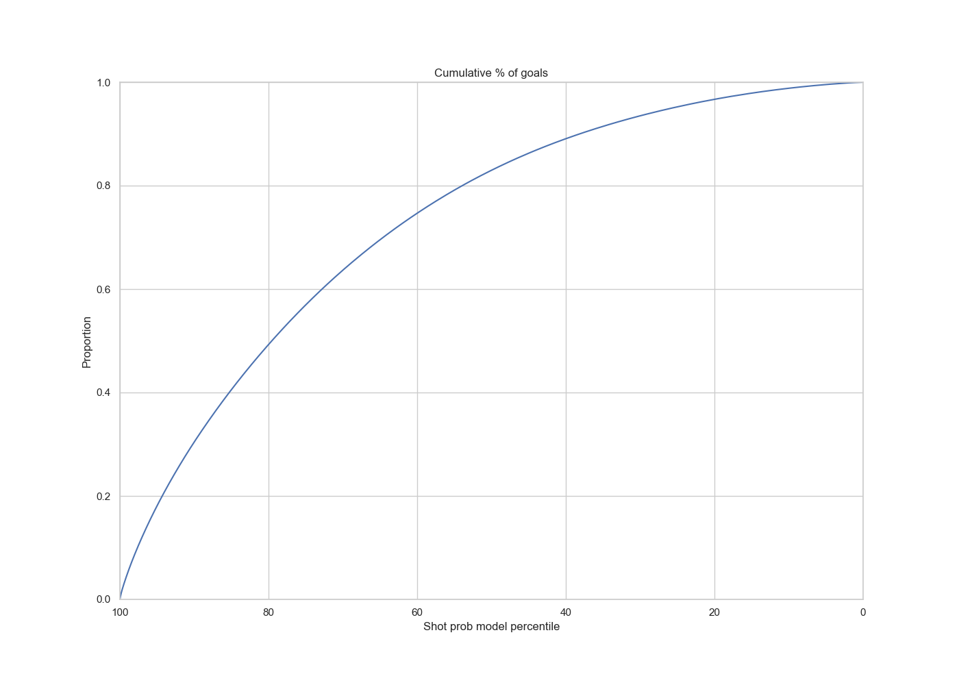
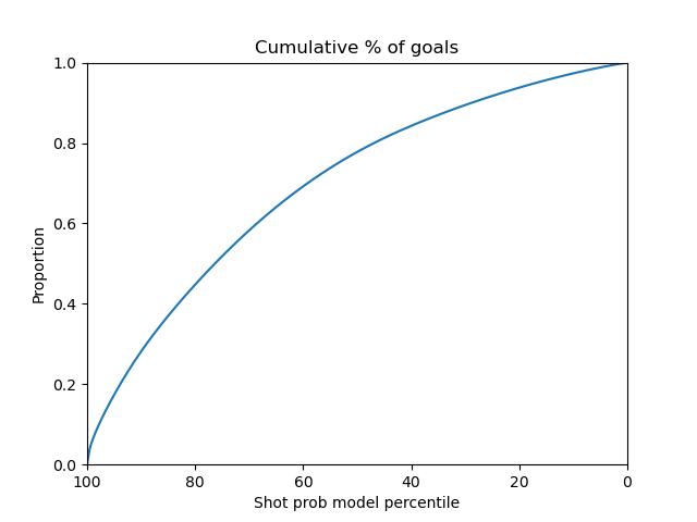
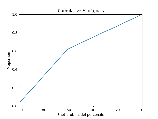
Cumulative Curves
ROC Curves
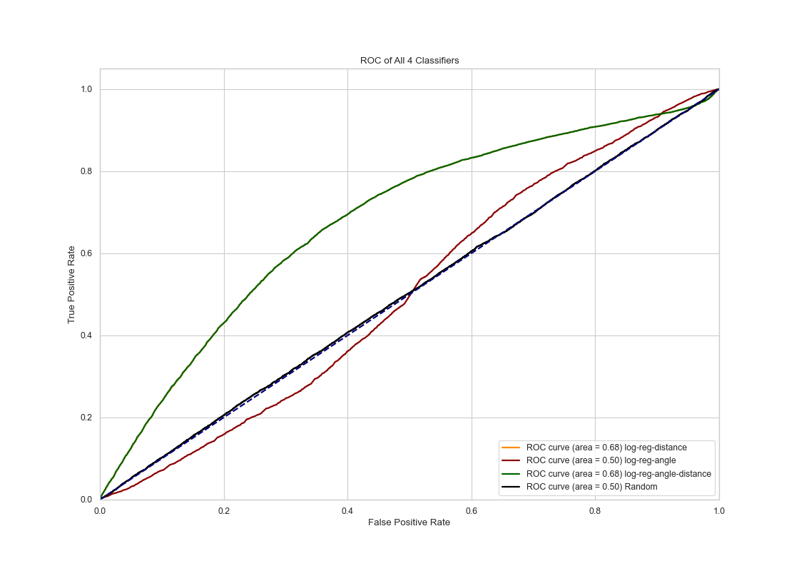
The ROC curves show that logistic regression with both distance and angle (or with just the angle) as features produce the best results. Logistic regression with only angle as feature produces a result not much better than a random guess.
Calibration Curves

For the calibration curves, we can also see that logistic regression with angle and distance produces some improvement, but its probabilistic predictions hardly fits a perfectly calibrated binary classifier.
Links to the experiment entries above in comet.ml
Logistic Regression, trained on distance
Logistic Regression, trained on angle only
Logistic regression , trained on both
Feature Engineering Part 2
This time we have added many novel features from the shot data to improve our model prediction.
Feature list Description (before preprocessing)
- Game_id : Id for the hockey game.
- Event_idx: Id for an event (shot or goal) in the game.
- Speed: (distance from the previous event)/(time since previous event seconds).
- periodSeconds_last: Time from the last event (seconds).
- eventType_last: Last event type.
- Rebound: True only if the last event was also a shot.
- Period: Period in the hockey game.
- periodType: Type of period in the game. (‘REGULAR’,’OVERTIME’,’SHOOTOUT’)
- periodTime: Min:sec, Time during the period.
- periodSeconds: PeriodTime converted to seconds.
- teamInfo: Name of team who made the shot.
- isGoal: True only if shot is goal.
- shotType: Different shot types.
- Coordinates_x: X coordinate where the event happened.
- Coordinates_y: Y coordinate where the event happened.
- Coordinates_x_last: X coordinate where the last event happened.
- Coordinates_y_last: Y coordinate where the last event happened.
- Distance_last: Distance between current and last event.
- Dist_goal: Distance between event and goal.
- Angle_goal: Angle [-180,180] between the shot event and goal.
- Angle_change: Only when the shot is a rebound, the change in angle between shots.
- Angle_speed: Angle_change/(time between current and last shot)
- Shooter: Name of the shooter.
- Goalie: Name of the goalie.
- emptyNet: True if a shot is taken on an empty Net.
- Strength: Strength of team on the playing field.
- homeTeam: Name of home team.
- awayTeam: Name of away team.
- homeSide: Left if home starts in period 1 on the left side, right otherwise.
The dataframe can be found in this link.
Advanced Models
Using all the newly added features, we made sure to preprocess the data into a numerical form.
- Redundant columns are dropped such as ‘game_id’, ‘event_idx’, ‘periodTime’.
- All columns with more than 60% NAN values are dropped.
- All rows with NAN values are dropped.
- ‘isGoal’, ‘rebound’, ‘emptyNet’, ‘homeSide’ columns are binarized into 0, 1.
- One hot encoding is applied to the columns ‘periodType’, ‘eventType_last’, ‘teamInfo’, ‘shotType’, ‘homeTeam’, ‘awayTeam’.
- ‘shooter’ and ‘goalie’ columns are dropped because of the low data variance. The total number of features ended up being 128.
After preprocessing, the data was stratified-split into train and validation sets. Grid Search CV was used to search for the most optimal model parameter during training and validation.
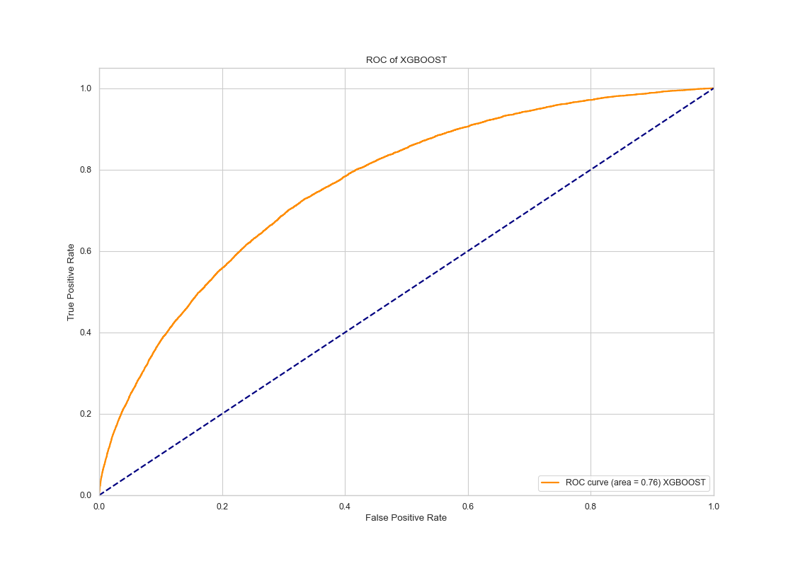
XGBoost Model
 |
 |
 |
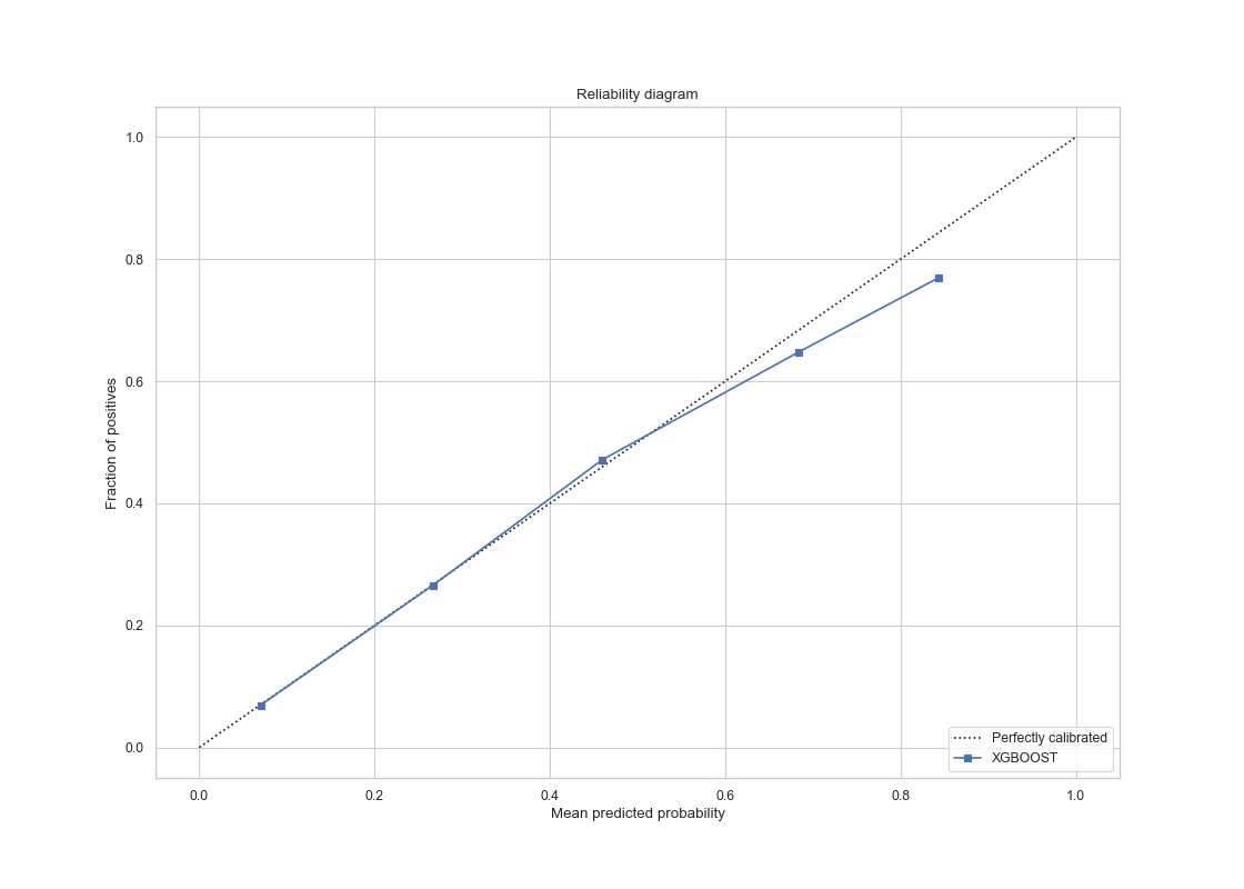 |
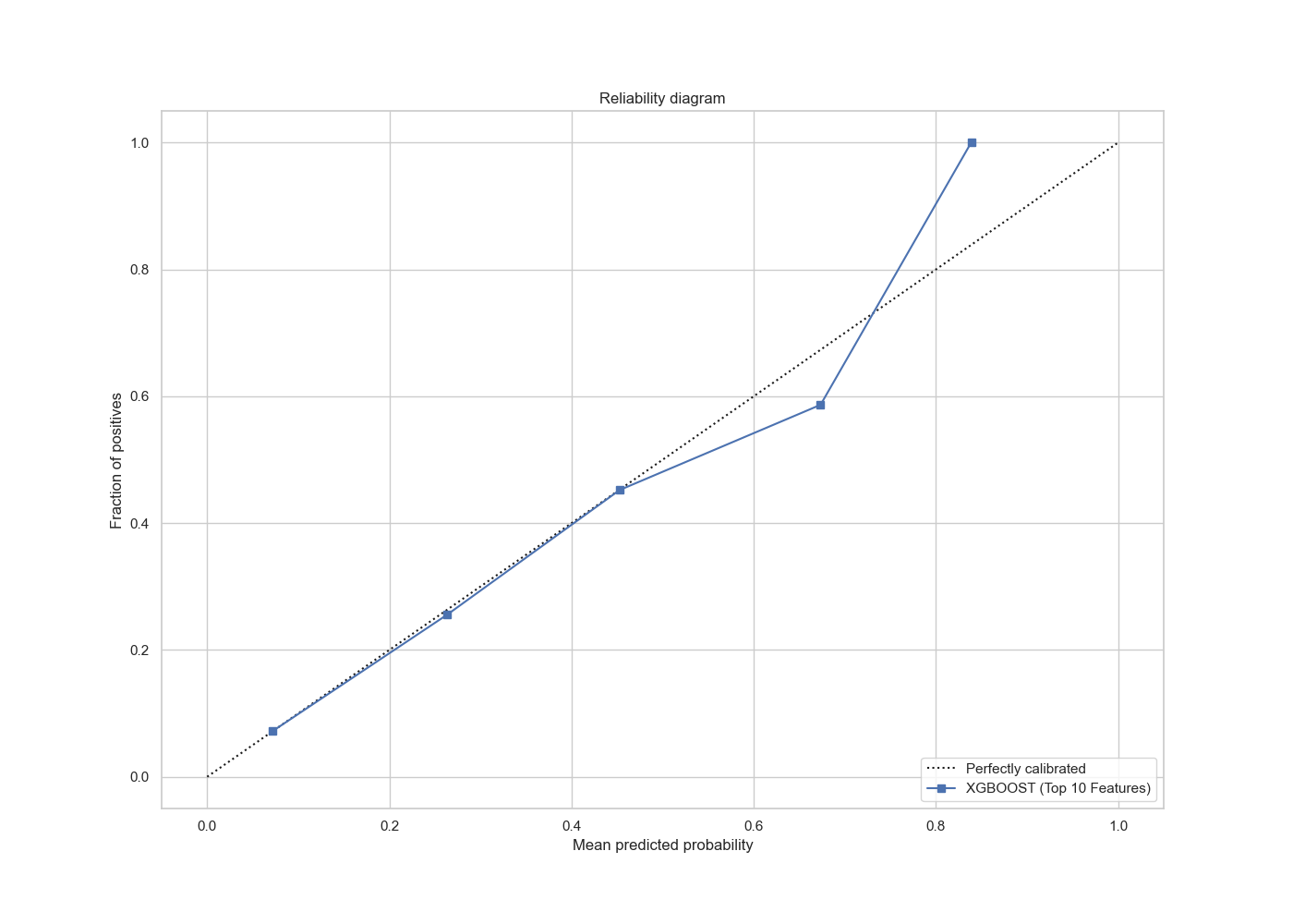
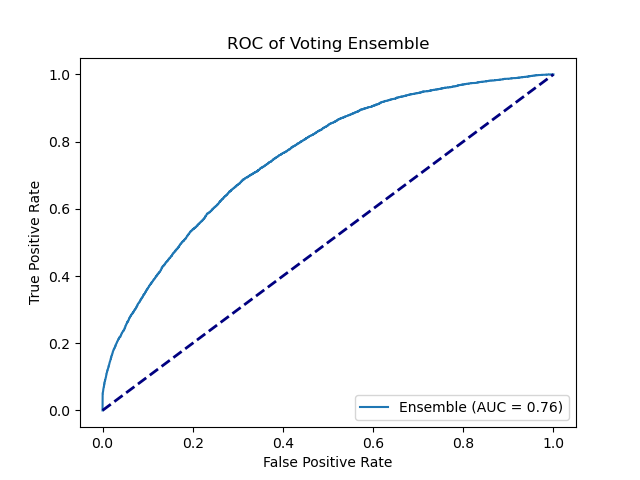
The ROC curve has AUC value of 0.76 and the calibration is much smoother compared to before, and it is almost perfectly calibrated in for mean probabilities less than 0.6. For probabilities larger than 0.6, suggesting hyperparameter search and additional features has improved the prediction in a significant manner.
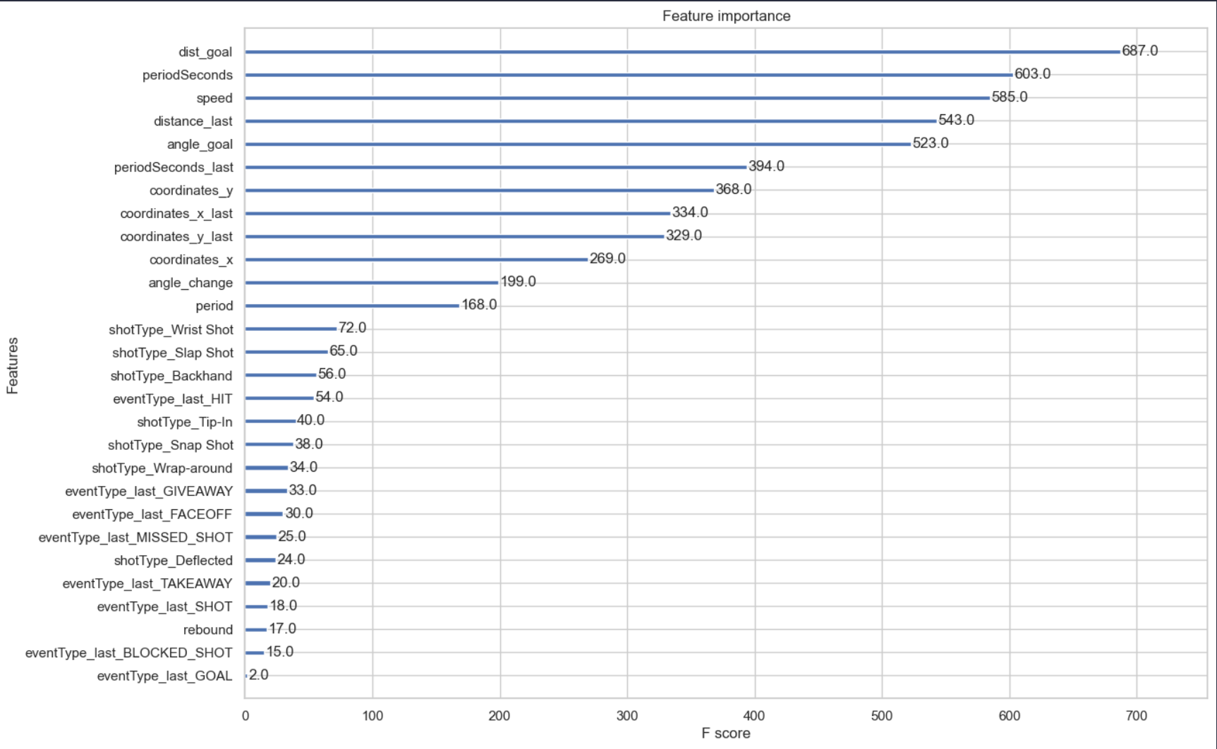
Feature selection on XGBoost
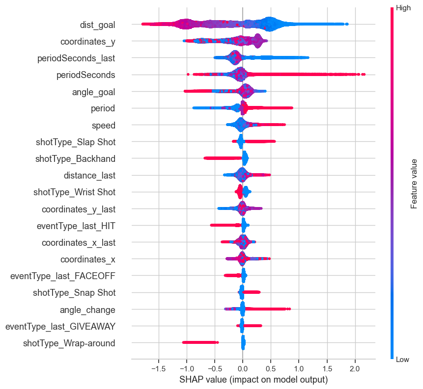
We have used various feature selection methods such as correlation matrix, XGboost feature importance weight, chi square method and SHAP value.
The selected features are the top 10 most important according to the picture listed below:
For reference, the correlation matrix is also included:

The SHAP value importance are as follows:
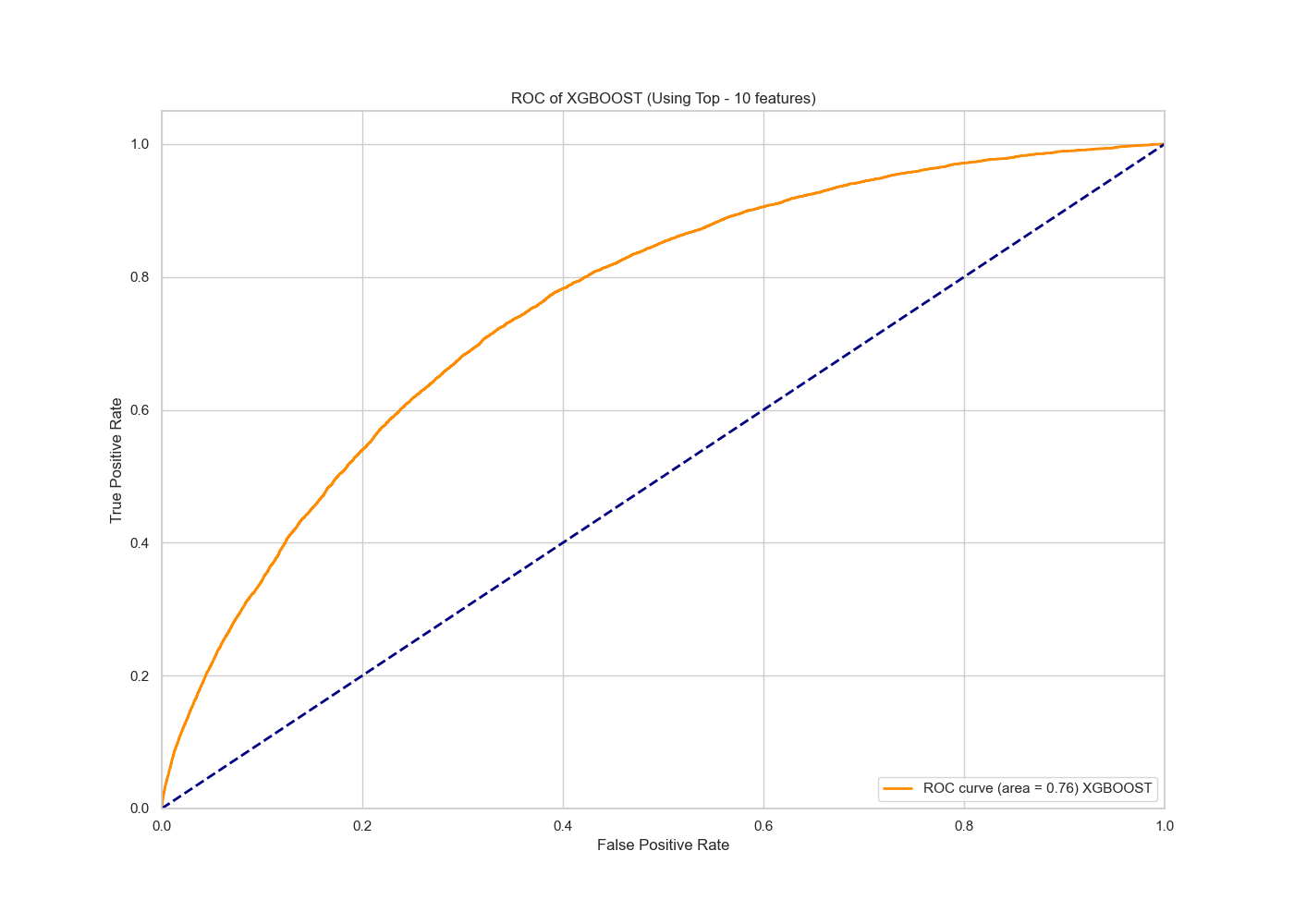
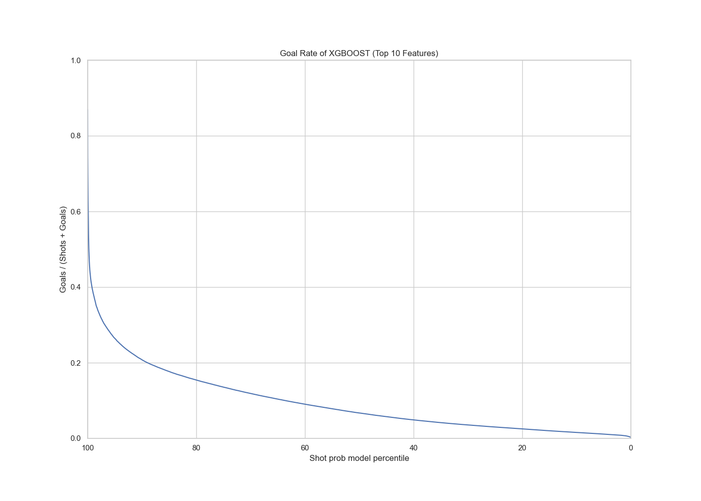
XGBoost Model with top 10 selected features
 |
 |
 |
 |
The AUC value is 0.76, which shows no deterioration from the full model, which suggests that our predictive power of the slimmed down model is as good as the full model.
More Advanced Models
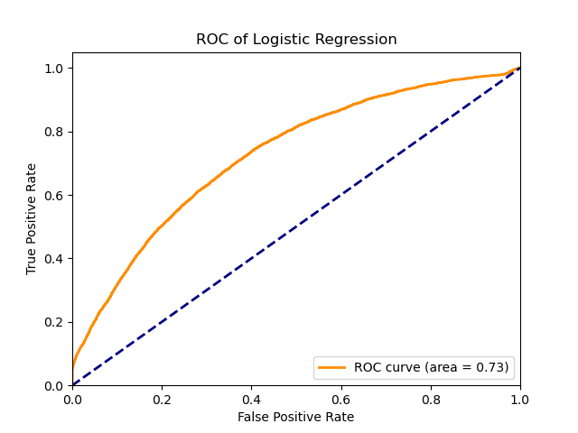
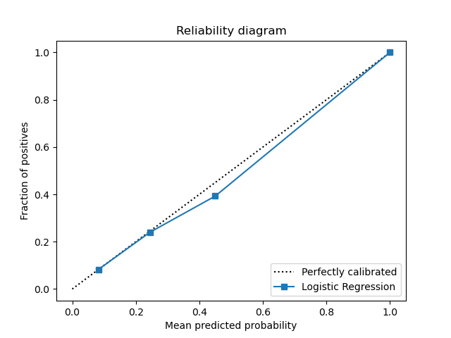
For the logistic regression model, a Grid Search CV strategy was used to select the C parameter and the number of components after fitting the data with PCA. The data is first standardized in the pipeline, then PCA is applied then finally the logistic regression model. The resulting best parameters were PCA_n=90, C=10000.
Below are the plots for the logistic regression model.
 |
 |
 |
 |
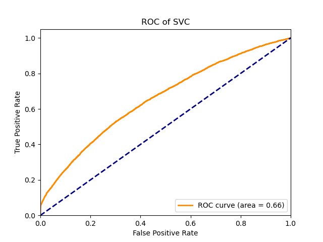
For the svc model, a Grid Search CV strategy was used to select the C, kernel parameters. The data is first standardized in the pipeline, then PCA (with number of components = 85) is applied then finally the svc model. The resulting best parameters were C=10, kernel=’rbf’.
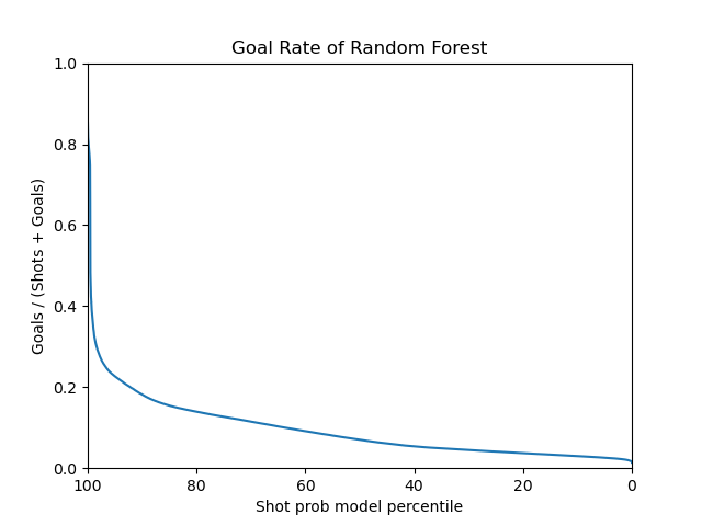
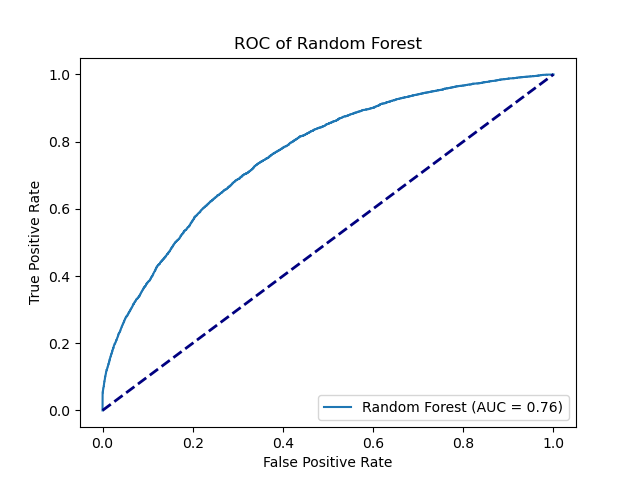
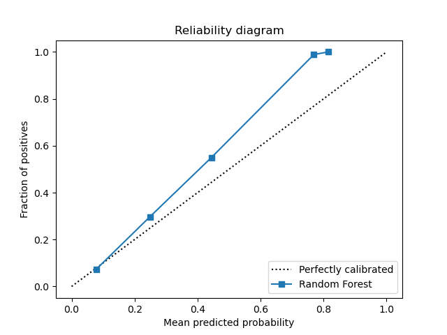
For the random forest model, The data is directly applied to the random forest model with the default parameters. The random forest model has an AUC of 0.76, highest among all models.
 |
 |
 |
 |
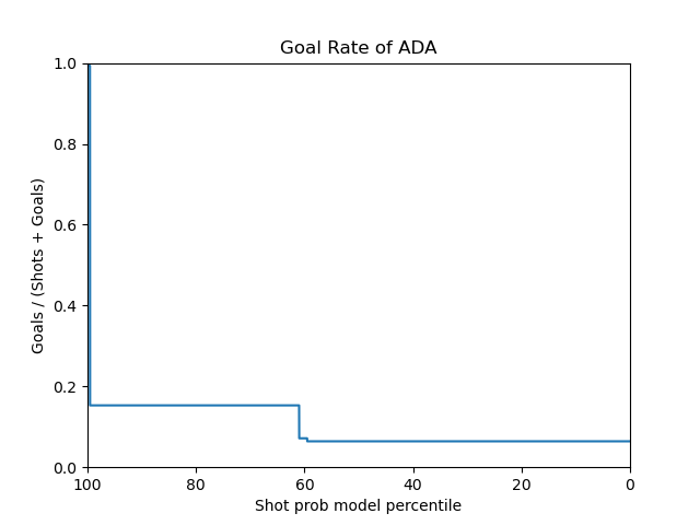
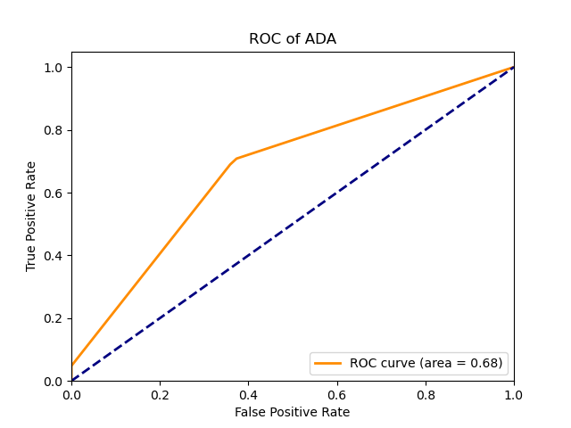
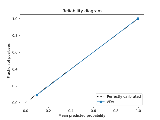
For the adaboost model, a Grid Search CV strategy was used to select the n_estimators, learning_rate parameters. The data is directly applied to the adaboost model. The resulting best parameters were n_estimators=10, learning_rate=0.01. The adaboost model has an AUC of 0.68.
Below are the plots for the adaboost model.
 |
 |
 |
 |
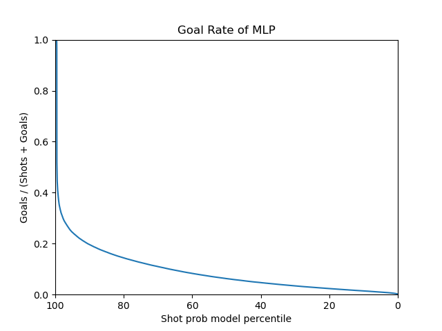
For the mlp model, a Grid Search CV strategy was used to select the hidden_layer_sizes. The data is first standardized in the pipeline, then PCA is applied then finally the mlp model. The resulting best parameters were C=10, kernel=’rbf’, hidden_layer_sizes = (100,100).
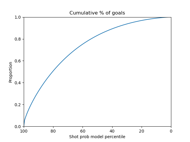
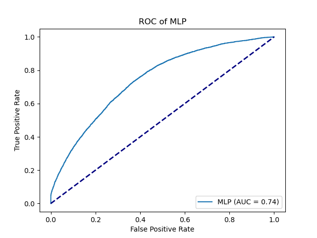
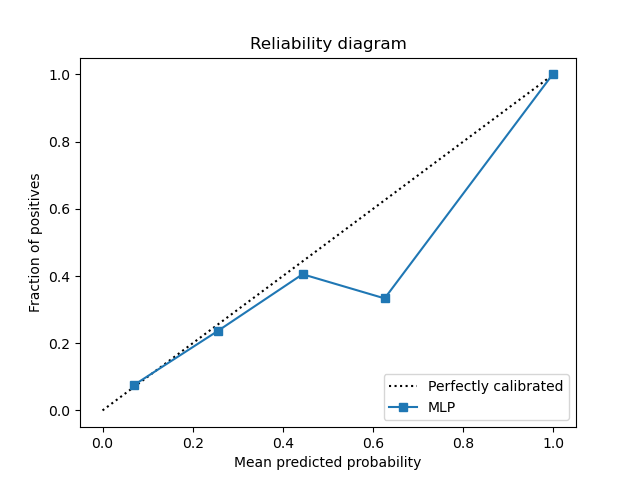
The MLP model seems to have a smooth curve on the shot prob model percentile plots. It has an AUC of 0.74
Below are the plots for the adaboost model.
 |
 |
 |
 |
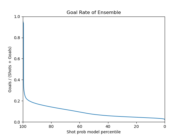
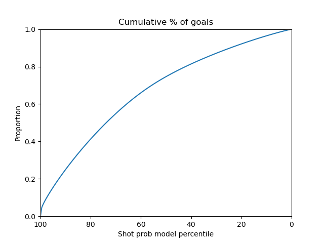
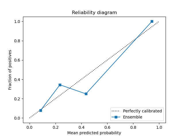
Finally For the voting ensemble model, we have included the previous random forest, mlp, logistic regression and adaboost models with equal weights. The data is fitted with soft voting. The final model used on the test set was the ensemble model in hopes for a better generalization performance. It has an AUC of 0.76 as good as the random forest model.
Below are the plots for the voting ensemble model.
 |
 |
 |
 |
The precision metric for most of the models are close to 1, other than svc (0.6). The f1 score is around 0.09 for most of the models, other than svc (0.12). The recall score is around 0.05 for most of the models, other than svc (0.067). These scores seem to be a lot lower because of the false negatives. It seems to be difficult for the models to learn which shots lead to a goal.
Experiment links on comet.ml for each of the models described above.
Evaluating on test set
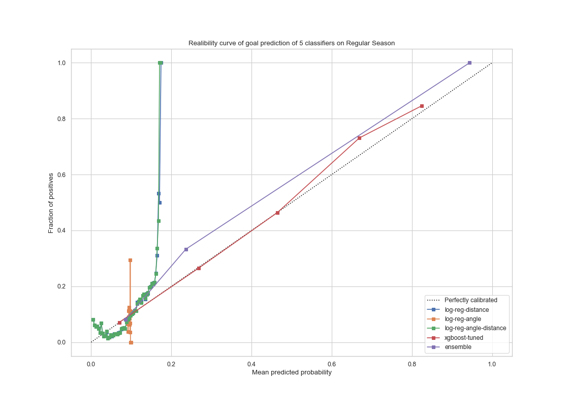
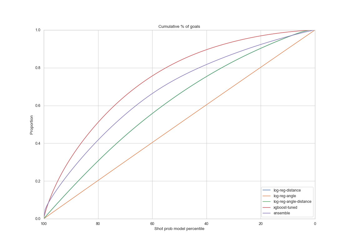
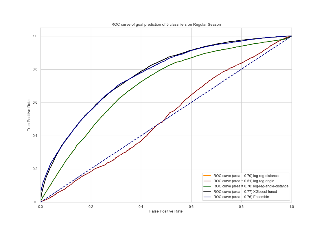
For models tested on the regular season test set, the results are the following:
 |
 |
 |
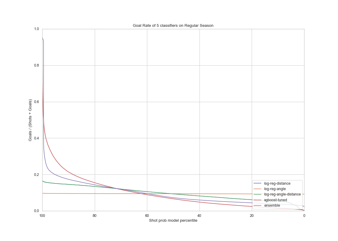 |
The voting ensemble model and the XGboost model had similar performance on the test set from the regular seasons as on the validation set. It performed slightly better on the test set for regular seasons. The AUC score of the ensemble and XGboost models are 0.76 and 0.77 respectively , on par with our result on the training data. This shows that the models gives a satisfactory result in terms of generalization.
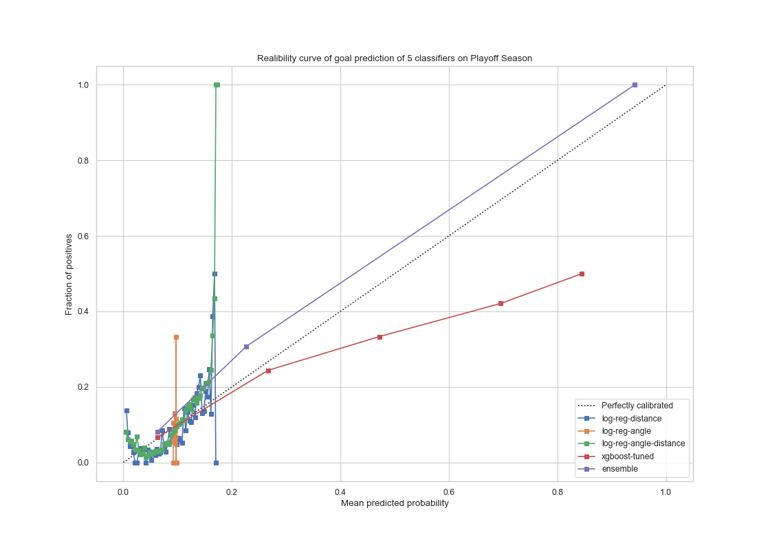
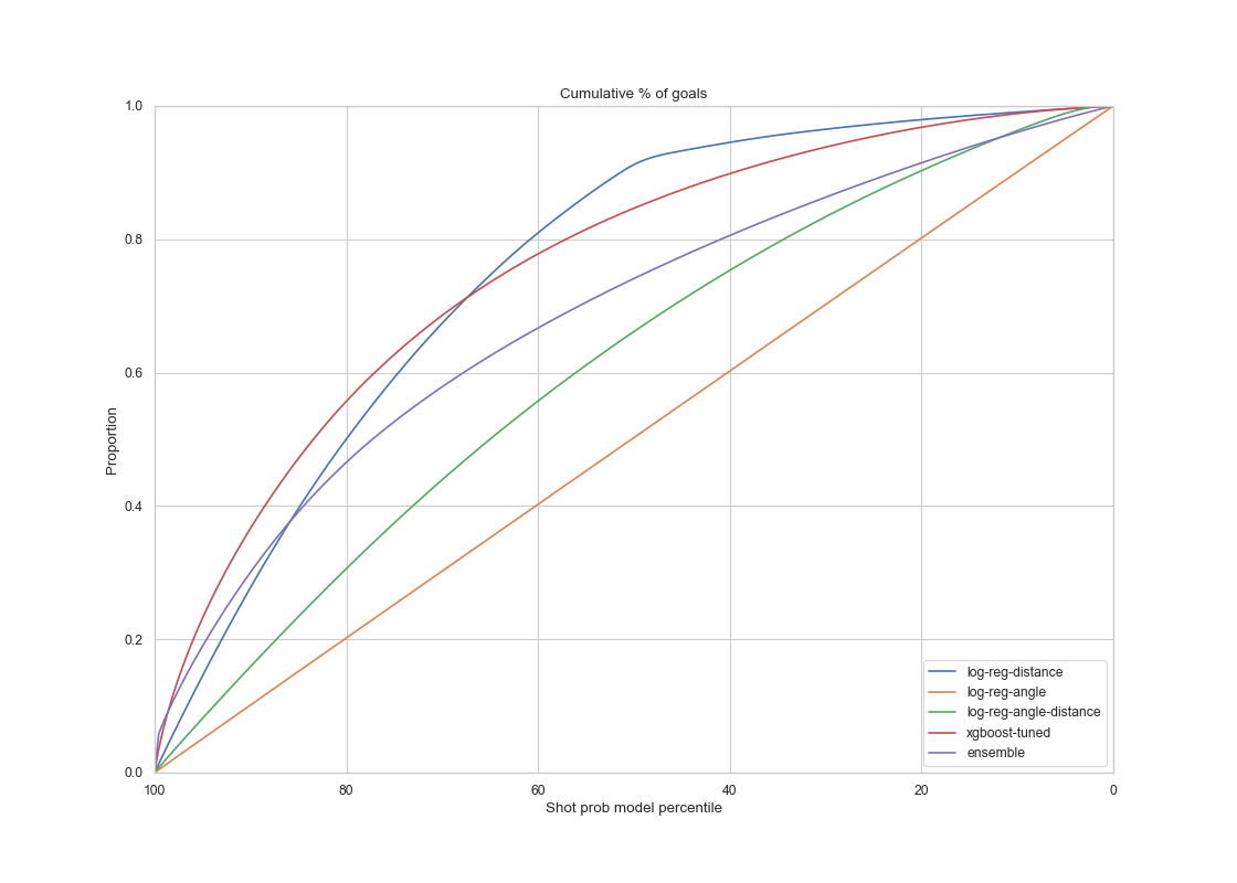
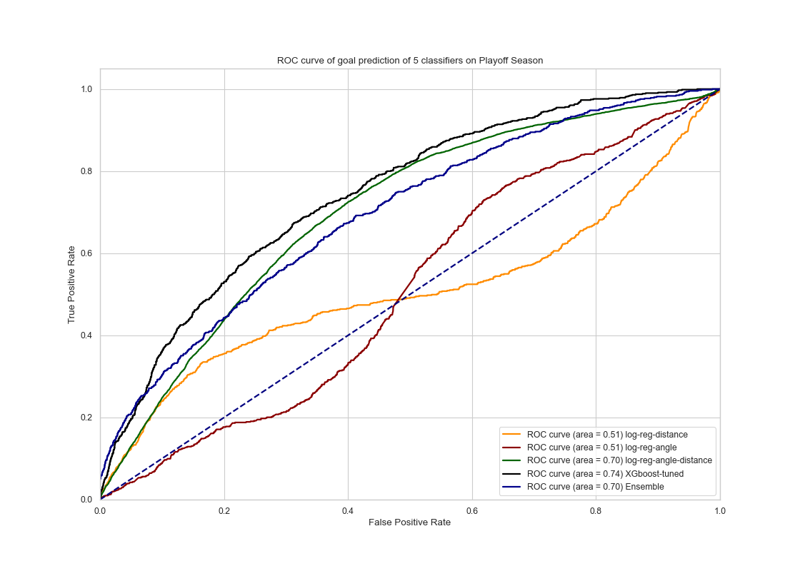
For models tested on the playoffs season test set, the results are the following:
 |
 |
 |
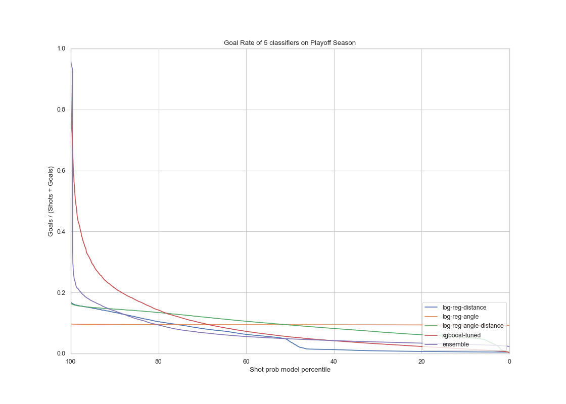 |
In conclusion, the voting ensemble model seems to generalize well as its performance on the test set from the playoffs data is comparably the same as on the validation set from the regular season data. The AUC score of the ensemble method is 0.70, which is a slight drop compared to our regular season prediction. It is still a satisfactory performance. However The fined tuned XGboost model had a better ROC curve with an AUC score of 0.74 which seems to do a better job compared to the ensemble model at ‘generalization’ performance.
tags: Hockey - Goal - Predictions